OVERVIEW

OLIVE: A RESPONSIVE WEB APP


Living in a digital age where everything is intertwined, it’s no surprise to hear that 1 in 5 adults use health apps in their daily lives. Of these health apps, there’s a growing interest in habit apps because of the potential for long-term lifestyle changes.

However, initial market research shows that while many habit apps emphasize the importance of building healthy habits, many overlook the other side of habit building: stopping bad habits.

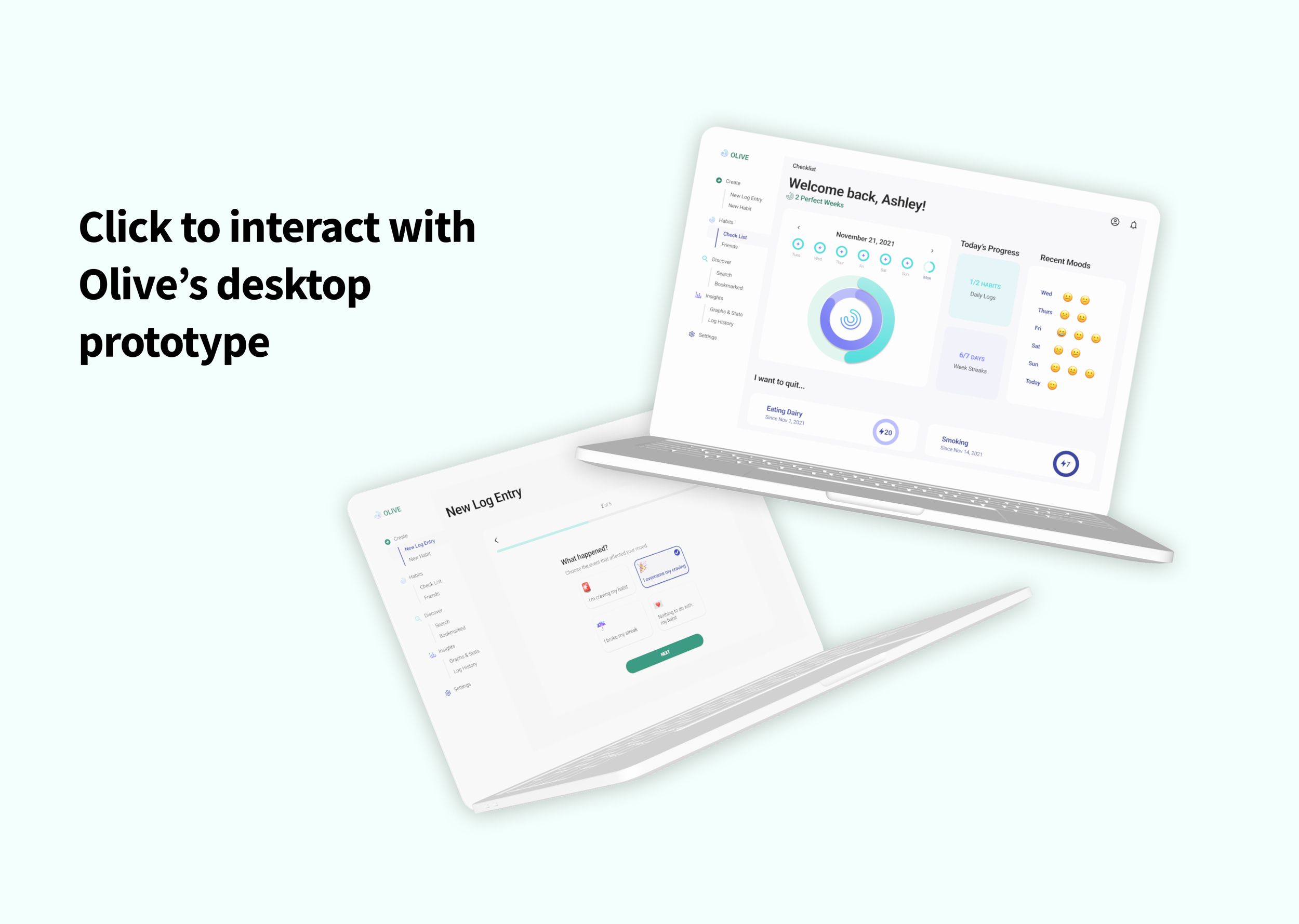
This inspired Olive, a responsive web application designed to motivate and track personalized goals so that users feel accountable to stop their bad habits and make positive lifestyle changes.


MY ROLE

UX/UI Designer

TASKS

Concept Development, Competitor Analysis, User Research, Wireframing, Prototyping, User Testing, Pitching

TOOLS

Figma, Optimal Workshop, Balsamiq, Adobe Photoshop

TIMELINE

August 2021 - April 2022


PROBLEM STATEMENT

Health-conscious people need an accountable way to log and track their wellbeing because they want to practice healthier lifestyles and experience more health satisfaction in their daily lives.

 
check a.png
 

EMPATHIZE

GATHERING THE PIECES

In order to better understand the problem space, I needed to know what was in the current market. I conducted a competitive analysis of 2 health & wellness apps: CareClinic and Tangerine. Gathering my insights, I created a SWOT profile of my findings.


Now that I knew the market, I needed to know my users. My research goals were to:


USER RESEARCH TO AFFINITY MAPPING

I conducted user research interviews with potential users in the target age range of 20-30s. I asked them questions like:

  • How do you feel about your current lifestyle?

  • What are your biggest challenges in terms of keeping a healthy lifestyle?

  • What have you found most helpful in keeping a healthy lifestyle?

With my findings, I conducted two sessions of affinity mapping in order to uncover key insights.


A CHANGE IN DIRECTION

I was surprised by the insights I uncovered. It seemed that with busy work lives, people saw habit building and goal setting intimidating and not worth the time investment. However, simply changing current habits—or making them cease to exist—was doable to users. As a result, Olive’s problem space was shifted from creating new habits to quitting bad habits.

So…what did this look like?


HOW MIGHT WE

How might we make health-conscious individuals feel confident that they are improving their lifestyles by changing their bad habits?

 
check a.png
 

DEFINE

INTRODUCING OUR USERS

To get an idea of who Olive users were, I created two user personas from the information I gathered. Creating user personas allowed me to gauge user needs and pain points before I started designing wireframes. Essentially, it put me into the shoes of the user.


Ashley Willis—Primary User Persona

Jackson Merrick—Secondary User Persona


It was also important for me to be able to gain a more in-depth understanding of my users’ perspectives before I began ideating for Olive. Creating a user journey map allowed me to narrate how my personas would go through the process of attempting to quit a habit. Knowing what type of journey my users would take and understanding why they would think that way was essential in my process of building a user-centric web app.


 IDEATE & PROTOTYPE

STRUCTURE WITH SITEMAPPING

My ideate phase began with site mapping, but I wanted to gain insight from my users about the structure. Therefore, I conducted a digital card sort with 6 participants using OptimaSort. The closed card sort consisted of 5 categories and 17 cards.

Using this data, I created my sitemap to visualize the information architecture of Olive. With the structure of the web application organized, I was finally ready to head to the drawing board.


Olive’s Revised Sitemap


FROM SKETCHES TO PROTOTYPE

After establishing my site and task flows, I began drawing my low-fidelity wireframes through paper sketches. I believe that it’s important to start with paper and pen because it allows me to look at the overall picture and focus on an actual experience with a tangible product, rather than focusing on the design components.

Using my paper sketches, I translated my designs into mid-fidelity wireframes using Balsamiq.


Low-to-mid fidelity wireframes (mobile & dektop) for creating a new log entry in Olive


Finally, I brought my user flows to life by creating a functional prototype of my mid-fidelity wireframes via Figma. Creating prototypes for my mobile and desktop versions prepared me for the next step of my design process: usability testing.


Mobile and desktop wireframes from mid-fidelity prototype created in Figma


 ITERATE

TESTING IT OUT

Now that I had two working prototypes, I wanted to make sure that my structure and design was intuitive to users. I conducted remote usability testing over the period of a week with 6 participants.

My test objectives were to:

  • Determine how quickly users understand the purpose of the responsive web app (i.e quitting habits and tracking the progress)

  • Observe how easily users interact with creating a log entry and its value

  • Observe how helpful users find the discover feature and the results it provides

  • Identify any pain points in how users navigate throughout the app in mobile and desktop versions


ITERATIONS ON ITERATIONS

To synthesize my findings, I organized my data through affinity mapping. Then, I created a rainbow spreadsheet to pinpoint the most frequent pain points users experienced while interacting with my prototypes. I rated my errors using Jakob Nielsen’s error severity rating scale.

I iterated and tested my design 2 more times with a high-fidelity prototype to make 3 major improvements on various feedback from my target users.


FIRST IMPROVEMENT

DATA VISUALIZATION


One of the biggest changes I made was on the homepage. I found out users were more interested in achieving their goals and having the visualization accessible right away. They wanted to see their goals, progress, and history to understand how they were doing at one glance.


ERROR SEVERITY
[1-5]

1 ; cosmetic problem

SOLUTION

Introducing progress ring, streaks, and recent moods


Olive’s homepage


2ND IMPROVEMENT

GUIDED ONBOARDING


The most common feedback I received from testing was that the number of log entries allowed in a day was unclear.

“I’m confused why there are multiple moods in Recent Moods?”

I realized that a guided onboarding experience was necessary to inform new users about Olive’s functions.


ERROR SEVERITY
[1-5]

3 ; major usability problem

SOLUTION

Adding a guided onboarding experience


Olive’s onboarding


3RD IMPROVEMENT

SIMPLIFIED LOG ENTRY


The log entry was originally designed to have just one screen with all of the questions. However, I found that users felt overloaded from seeing the length of the screen. The same feedback applied to the mood tracker where I realized that users preferred simple concrete answers to questions.

As a result, I separated each question into its own page and removed the emoticon scroll. The second session of testing showed that users felt that the log entry was quick and simple from this change.


ERROR SEVERITY
[1-5]

2 ; minor usability problem

SOLUTION

Making each question its own page


Mid-fid log entry redesigned as high-fid individual pages


FINAL STEPS

POLISHING THE DESIGN

Olive seeks to create a clean and modern digital experience through data visualization and its color usage. The design evokes feelings of health, productivity, and success as users engage with the web app.

As one of my final steps, I created a design language system which documented the web app’s visual components. The DLS included details on Olive’s colors, typography, UI elements & styles, imagery, iconography, grids & layouts, and language & tone.

It was important to consider the responsive flow between desktop and mobile during this stage. Using a mobile-first approach, I first designed for my mobile prototype and then adjusted accordingly for desktop. This ensured that Olive was consistent and accessible to users in all of its forms.


OLIVE TODAY

With my new iterations and defined UI, I finalized my high fidelity prototype. In addition to usability testing, I also participated in design critique with 7 other people in the design community to receive feedback on Olive.

Furthermore, I reviewed WCAG so that my design's elements passed AA standards. This was important as accessibility is essential for good UX design. Bringing together all of these final touches, Olive’s final prototype was born.

Welcome to Olive.


check a.png
Objective.png
 

MOVING FORWARD

NEXT STEPS


📝 RE-TESTING

Testing the iterated high-fidelity prototype for usability and functionality with a wider user audience.

🎨 IMPROVING ANIMATIONS

Improving animations and transitions can be a small change that provides a huge increase in the user experience.

💡 NEW FEATURES

Adding weekly challenges and rewards to see if positive reinforcement increases user retention.

🔍 WCAG STANDARDS

Finding areas of improvement in regards to WCAG guidelines so that the app grows in accessibility.


TAKEAWAYS

LESSONS LEARNED

Going through the end-to-end design process for Olive showed me how crucial each step was. Doing my research and defining my objectives was necessary for me not to stray from my original problem space.

Through prototyping and user testing, I was able to focus more on what users wanted as a design solution and not only what I assumed. Gathering data allowed me to truly understand how users interacted with my product and what they wanted as a user.

Most importantly, I’ve realized that iteration never stops. Each day brings upon another change my design needs, and these changes are what has brought Olive to its current phase.

The design process is a never-ending loop—but each cycle brings about new insights and the chance for a better user experience.


UP NEXT